Source Support
Worked to update the client's website to include better navigation for a less confused user experience. Reduced content and upped visual cues throughout the design to ensure that no time is wasted on the site.
Project included creating UI design system in Figma, product design, UX, and WordPress development.

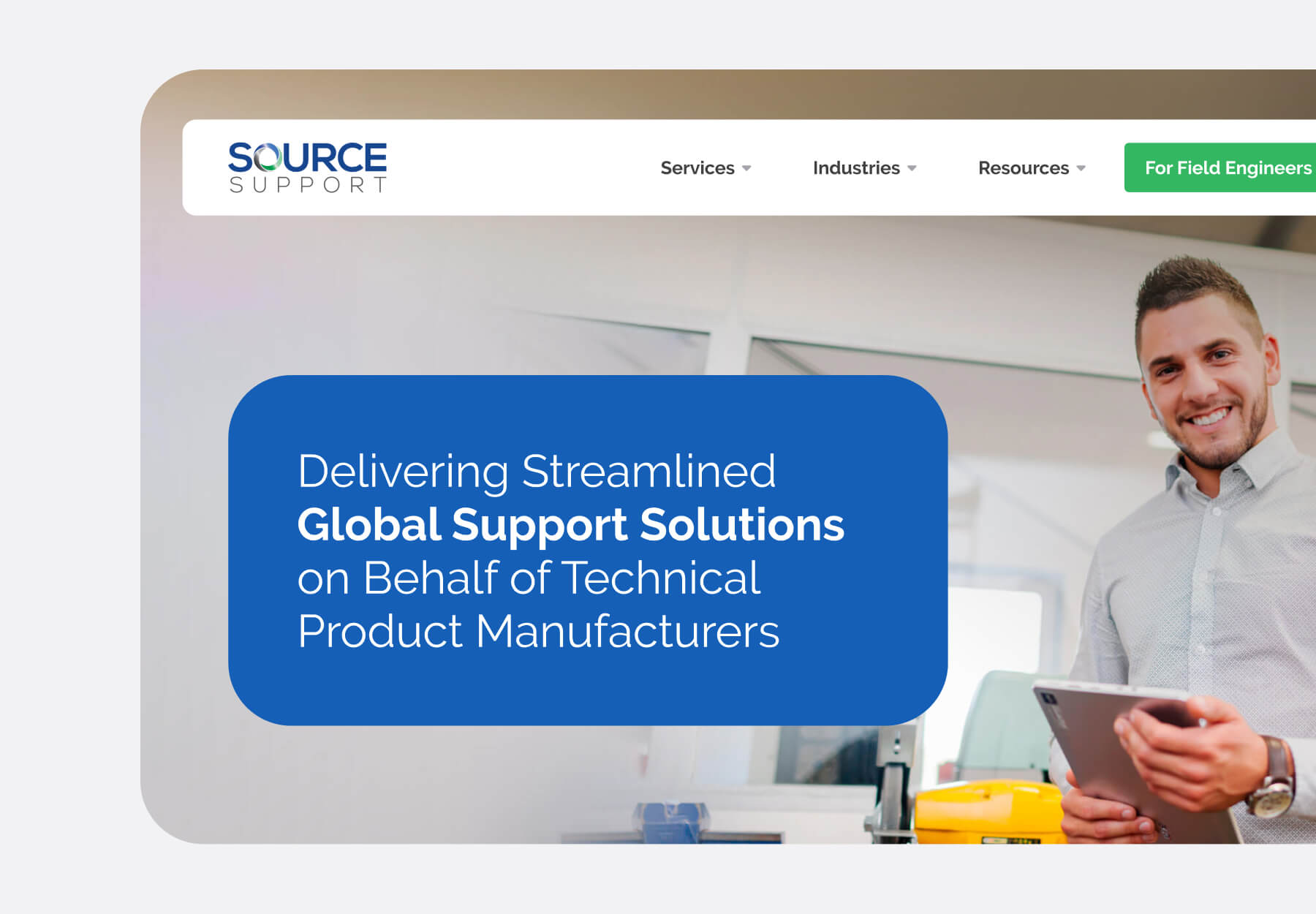
Source Support delivers global support solutions on behalf of technical product manufactures. Their Techworks team of engineers is second to none, and their list of services is extensive. Now, it’s time that their website makes this more clear to their users.
They’re looking to scale up the ‘global’, and scale down the time it takes users to find what they need on the site
Key Findings research
Based on the insights obtained through this process, we derived three key findings:
1. Navigation
– How can we ensure that the user finds the content they’re looking for, without overwhelming them with dropdowns and more dropdowns?
2. Multiple Audiences
– How can we speak to both potential customers, as well as field engineers wanting to join our network?
3. Source Innovation
– How do we put the proprietary Source Innovations to the forefront in this global market?


We equally organized the mobile menu into a two-step experience, so as not to overwhelm the user with information they don’t need.
Let the user choose their content
Content Organization
We deployed a mega menu to accommodate all of the site offerings in a visually easy-to-digest way.
Visual cues are key
Content Cards
We curated the services information to the users’ current position and interest in the site. As the user goes deeper, they’re met with just the right amount of information to get them one step further.
Services and Source Innovation are placed in the fore-front of the design


